User interface overview
These are the core parts of the user interface for web editors. The add-on works for both property and on-page editing.
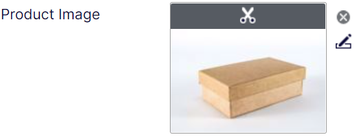
Single image properties
A SingleImage property has a single form factor. It can, however, have one or more proportions formats defined, depending on required constraints.
Cropping
Clicking the thumbnail, or the little scissors icon, opens the crop dialog.
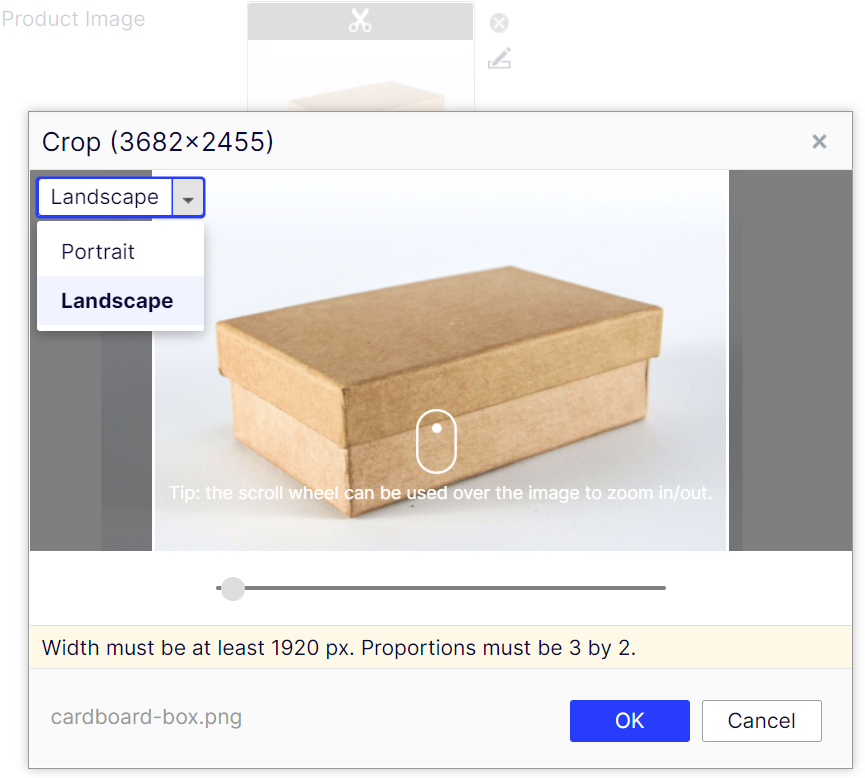
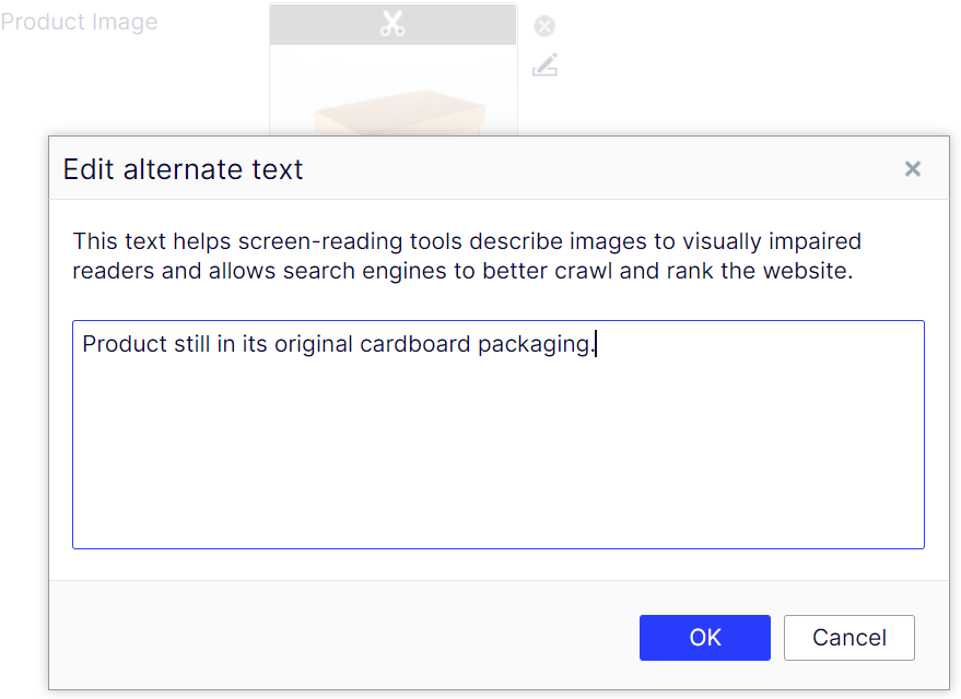
Image description
It is also possible to specify an image description, normally rendered as an alt attribute on the img element.
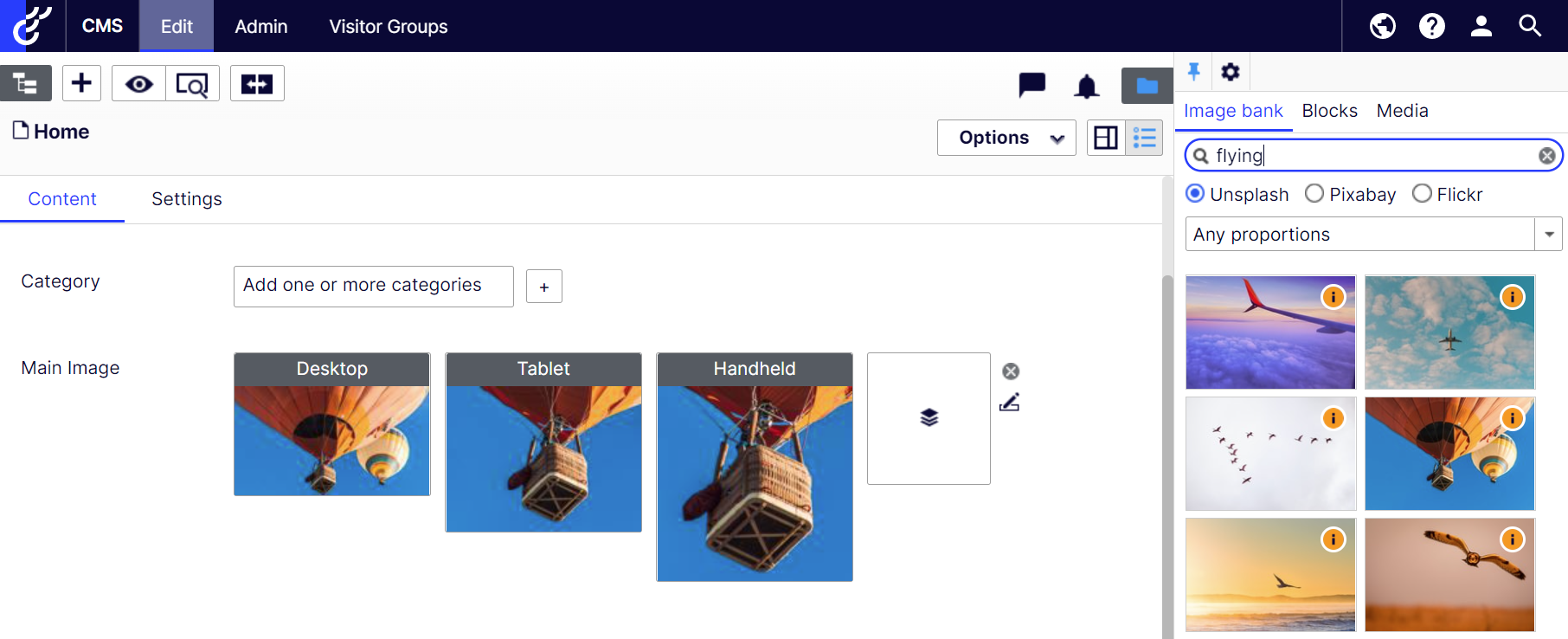
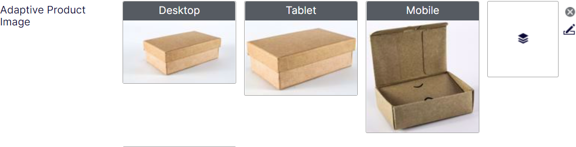
Adaptive image properties
An AdaptiveImage has three form factors, commonly used for three main screen types, e.g. desktop, tablet, and mobile.
Each form factor can have its own image, constraints, and/or cropping.
Dragging-and-dropping an image to the drop zone sets all form factors to the same original image.
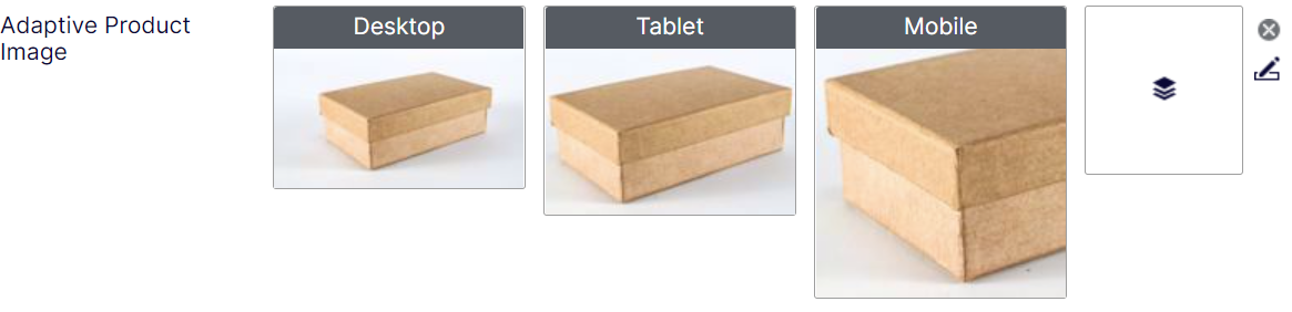
If cropping the form factors differently isn't enough, each form factor can have separate images.
List properties
List properties are useful for when you need to add an arbitrary number of images, for example to create a slideshow.
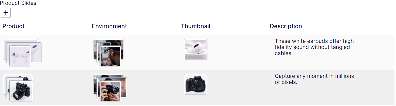
Image bank
If one or more searchable image providers are added, they appear in the Image bank component.